|
Some ideas for your website
|
|
Dear Fabio and Bharath,
|
|
It's been a while since we built the CDL website. The way we design and build has changed a lot since then, so we took another look at your site and asked how we'd approach it today.
|
|
We've put together four directions. The first keeps your current site and improves it. The others start fresh. Each is a fully responsive prototype you can explore on desktop and mobile.
|
|
We only changed things where we think it makes a real difference: easier to read, easier to keep up to date, and a design that will still look right in a few years.
|
|
|
|
|
|
YOUR CURRENT SITE, UPGRADED
|
|
01. Evolved
|
|
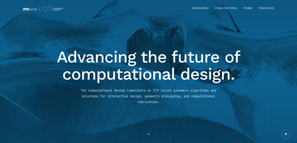
Still clearly your site. The same colours, typefaces, video hero and section order, with the carousels replaced by a clear publications grid and a team section that shows everyone at once.
|
|
|
|
|
|
|
|
|
|
02. Calm and structured
|
|
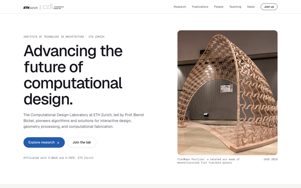
A light, structured layout in ETH Blue, led by the FlexMaps Pavilion. Publications become a clear list with PDF, code and project links for each paper.
|
|
|
|
|
|
|
|
|
|
03. The built world
|
|
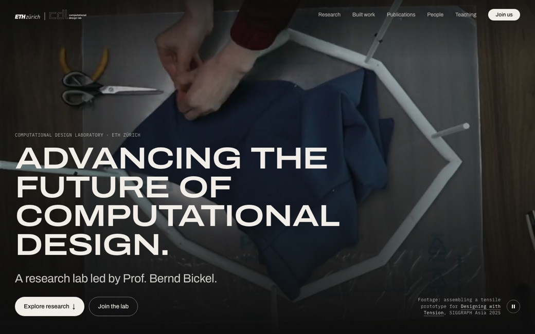
A dark, photographic direction. The hero is your own footage of a tensile prototype being assembled, and a Built work section shows the physical side of your research.
|
|
|
|
|
|
|
|
|
|
04. Playful rigour
|
|
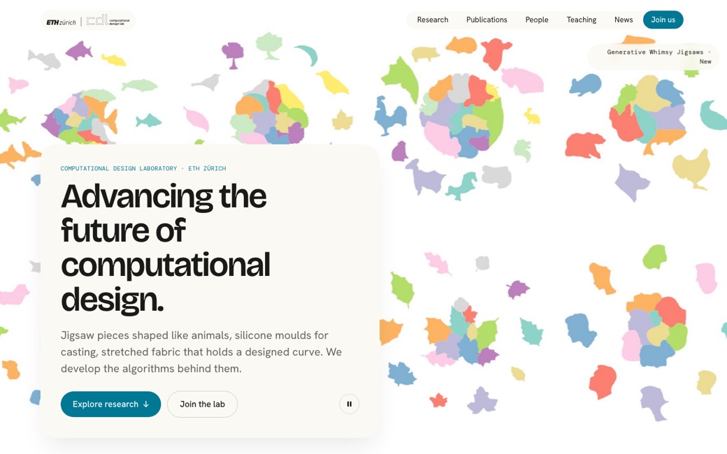
A light, colourful direction led by your own renders, starting with Generative Whimsy Jigsaws, followed by a spotlight on your newest paper.
|
|
|
|
|
|
There's no commitment here. At this stage we'd just like your first instinct. Does one of these feel right for CDL? You don't need to comment on every detail.
|
|
If one catches your eye, we'd be glad to walk you through it on a short call and talk about what it would take.
|
|
We'd love to hear what you think.
Adrian and the ANTE Team
|
|
|
|
ANTE & Co.
|
|
Design • Systems • Software
|
|
© 2026 ANTE & Co. All rights reserved.
|
|
|
|
|
|